Custom banner
The custom banner component lets you overlay text and calls-to-action on images, with options for desktop/mobile images, headings, and flexible positioning.
What is the custom banner component?
The Custom Banner component lets you overlay text and calls-to-action on images, with options for desktop/mobile images, headings, and flexible positioning. You can add subheading, heading, intro text, CTA text, and CTA URL, and control the overlay position and style.
Open the CMS editor where you want to add or edit a Custom Banner component.
Drag the custom banner component onto your page.
Upload both a desktop image and a mobile image as needed.
Enter subheading, heading, intro text, CTA text, and CTA URL.
Choose text link style, extra classes, heading type, lazyload, overlay position, and text color (light/dark).
Save your changes in the editor.
Please see the quick how to video for how the custom banner works:
Additional options (V2)
Some sites may have a V2 version of the banner with extra options:
- Linkaround: The whole banner links to the CTA URL, not just the button.
- Mobile Position settings: Mobile overlay position can differ from desktop.
- Mobile Position default change: By default, text is under the banner on mobile, but can be set to overlay.
Custom banner component settings
All Custom Banner components support the standard CMS settings below. Use these tabs to control layout, typography, and display for your banner:
Settings
Sub heading
Add a sub heading to the banner.
Sub heading classes
In this box you can add classes that are defined elsewhere on the site to a specific place.
Heading
Set the text in heading.
Intro text
Add intro text to the banner.
CTA text
Set the text in the call to action button.
CTA URL
Set the URL for the call to action button. For pages on the same site use a relative URL (e.g., /about-us). For external sites use the full URL (e.g., https://www.example.com).
Button style
Choose the style of the CTA button: primary (default), secondary, outline primary, outline secondary, link, or text only.
Mobile image
Upload the image to be used on mobile devices. This can be done by clicking and selecting a file, dragging a file to the box or choosing load asset and using an already uploaded image from the data and assets manager.
Desktop image
Upload the image to be used on desktop devices. This can be done by clicking and selecting a file, dragging a file to the box or choosing load asset and using an already uploaded image from the data and assets manager.
Heading element
Choose the HTML element for the heading: h1, h2, h3, h4, h5, h6
Lazyload
Enable lazy loading for the banner image to improve page load performance. Select True or false.
General
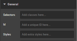
Selectors
In this box you can add classes that are defined elsewhere on the site to a specific page.
Styles
Styles are used to add a specific style not predefined in a class. You can add style settings which can be applied against any component.
ID
ID is used to direct user to an element of the page or identify it for future use, so you can link to this aspect of the page.
Image alt tag
This section allows you to use an alt tag for the image. By default, the heading is used.
Extra
This section controls the appearance and position of the text that appears on the banner.
Vertical alignment
Select alignment: Top, middle, or bottom.
Horizontal alignment
Select alignment: Left, centre, or right.
Text style
Select Dark, light or White with Gold text
Sub heading margin
Select normal or large.
How is this guide?
Last updated on