Carousel slide
The Carousel slide component is used to contain and display content within a carousel, allowing multiple slides per carousel in the CMS.
What is the Carousel slide component?
The Carousel slide component is used to contain and display content within a carousel.
Open the CMS editor where you want to add or edit a carousel slide.
Add a Carousel block to your page layout.
Add one or more Carousel Slide blocks inside the Carousel.
Place this block inside a carousel, and use multiple Carousel Slides for each separate slide you want to show.
Save your changes in the editor.
Slides appear vertically stacked in the editor, but will appear as slides in the carousel on the live site.
Add content to the slide, such as a custom banner or image.
Upload or select an image if your slide requires one.
Generic CMS component settings
All CMS components, including the Carousel Slide, can be controlled using the following settings.
General
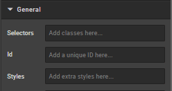
Selectors
Add classes defined elsewhere on the site to a specific page.
ID
Direct users to an element or identify it for future use (e.g., anchor links).
Styles
Add custom styles not predefined in a class. Examples:
- Margin (e.g.,
margin:,margin-top:) - Padding (e.g.,
padding:,padding-top:) - Max Width
- Font
- Border
- ID
Examples:
max-width: 352px!important;
margin-bottom: 0 auto;
padding-top: 30px;
To center an image: margin:auto;
To center text/markdown: text-align: center;
To make a component go edge-to-edge: margin-left:-15px;margin-right:-15px
Typography
Controls the text that appears on the page.
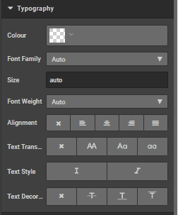
Colour
Change text colour (hex codes, e.g., #ff0000 for red).
Font family
Specify or inherit the default font.
Size
Specify or inherit the default size.
Weight
Choose from 'light', 'normal', 'bold', or 'auto'.
Alignment
Select from: no alignment, left, centre, right, justify.
Text transform
Change case: block capitals, lower, title, or none.
Text style
Choose italic or not.
Text decoration
Choose none, strikethrough, underline, or overline.
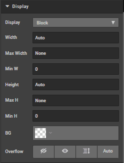
Display
Choose from: block (default), flex, inline, none, inline block.
Width/Max width/Min width
Specify width constraints.
Height/Max height/Min height
Specify height constraints.
BG
Change background colour.
Overflow
Choose from visible, hidden, scroll, scroll x.
Spacing
Click margins or borders to increase by pixels.
Borders
Click to increase border by pixels.
How is this guide?
Last updated on