Dashboard
How to customise and configure the Remarkable Commerce Manager dashboard, manage widgets, and adjust display settings.
Watch the short video walkthrough for a quick tour of dashboard customisation.
How to customise your dashboard
Adjust daily sales targets
To adjust daily sales targets, contact your developer.
Remove and add graphs from dashboard
Use the steps below to restore or modify the set of graphs shown on your dashboard.
Go to your profile in the admin in the top right. Click on account settings: 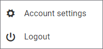
At the bottom of the page is dashboards; there you can select which graphs to show: 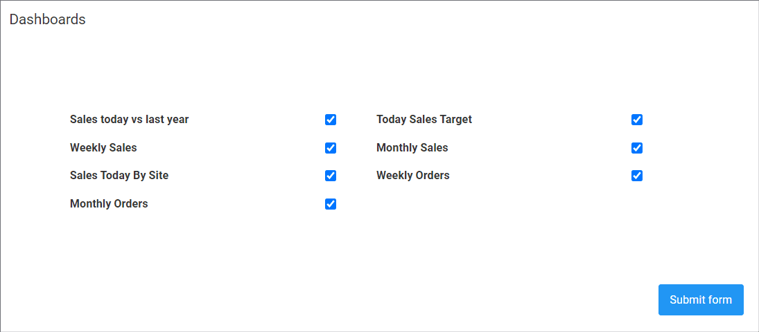
Set date range for graph reports
- For daily graphs/reports the dropdown in the top right allows you to look at previous days.
- For weekly graphs the dropdown in the top right allows you to look at previous weeks.
- For monthly graphs the dropdown in the top right allows you to look at previous years, as these show performance over the whole year.
Show graphs full or half width
To change the size of the graphs, select "small" for half width graphs and "large" for full width graphs from the dropdown box in the top left of the graph box.
How is this guide?
Last updated on