Hero grid
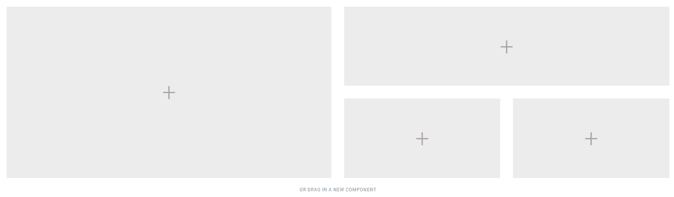
The Hero grid component creates a grid layout with a large block and double-length block, plus two blocks underneath. Supports left or right alignment.
What is the hero grid component?
The hero grid component creates a grid layout with one large block, one double-length block, and two blocks underneath. You can align the grid left or right as needed.
Open the CMS editor where you want to add or edit a Hero Grid component.
Drag the hero grid component onto your page.
Set the grid to left or right alignment as needed.
Add content blocks to each area of the grid.
Save your changes in the editor.
Hero grid component settings
All hero grid components support the General CMS settings below.
General
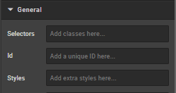
Selectors
In this box you can add classes that are defined elsewhere on the site to a specific page.
ID
ID is used to direct user to an element of the page or identify it for future use, so you can link to this aspect of the page.
Styles
Styles are used to add a specific style not predefined in a class. You can add style settings which can be applied against any component. Below are a list of styles you can add:
- Margin (either just
"margin:"or specific sides of a component like"margin-top:"or"margin-left:") - Padding (either just
"padding:"or specific sides of a component like"padding-top:"or"padding-left:") - Max Width
- Font
- Border
- ID
Examples:
max-width: 352px!important;
margin-bottom: 0 auto;
padding-top: 30px;
To center an image: margin:auto;
To center text/markdown: text-align: center;
To make a component go edge-to-edge: margin-left:-15px;margin-right:-15px
How is this guide?
Last updated on