Markdown
The markdown component lets you add formatted text using markdown syntax. Supports headings, links, lists, tables, and more.
What is the markdown component?
The markdown component lets you add formatted text using markdown syntax. Supports headings, links, lists, tables, and more.
Open the CMS editor where you want to add or edit a Markdown component.
Drag the markdown component onto your page.
Type or paste your markdown-formatted text into the component.
Save your changes in the editor.
Markdown syntax help
Headings
Hash tags are used to denote headings with # insert title a H1, then each additional hash represents a lower heading level.
Links
Links in markdown are created using brackets, the link text should be in square brackets and the link destination in rounded brackets:
[Docs site](docs.remarkable.net)`Text styles
To make text bold, use double asterisks. For italic, use single asterisks:
**bold text**how it looks
Bullets
Bullets can be added by adding a hyphen, asterisk, or plus before the text. Numbered lists are also supported:
		- list 1
- list 2-
list 1
-
list 2
- Numbered list
- are added
- as displayed
Tables
Tables are created using pipes. Colons are used to align the content:
		| Heading 1 |  Heading 2 | Heading 3 |
		| --------- |------------| --------- |
		|           |            |           |
		|           |            |           |
| | | || Heading 1 | Heading 2 | Heading 3 |
|---|---|---|
The markdown editor in the cms can be popped out to create a larger editing window that is easier to work in. The editor also contains a link to a useful cheat sheet.
Markdown component settings
All markdown components support the standard CMS settings below. Use these tabs to control layout, typography, and display for your markdown block:
General
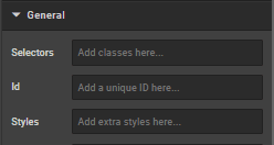
Selectors
In this box you can add classes that are defined elsewhere on the site to a specific page.
ID
ID is used to direct user to an element of the page or identify it for future use, so you can link to this aspect of the page.
Styles
Styles are used to add a specific style not predefined in a class. You can add style settings which can be applied against any component. Below are a list of styles you can add:
- Margin (either just
"margin:"or specific sides of a component like"margin-top:"or"margin-left:") - Padding (either just
"padding:"or specific sides of a component like"padding-top:"or"padding-left:") - Max Width
- Font
- Border
- ID
Examples:
max-width: 352px!important;
margin-bottom: 0 auto;
padding-top: 30px;
To center an image: margin:auto;
To center text/markdown: text-align: center;
To make a component go edge-to-edge: margin-left:-15px;margin-right:-15px
Typography
This section controls the text that appears on the page.
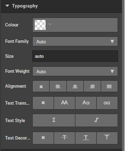
Colour
This box can be used to change the colour of the text. Use hex colour codes eg Red #ff0000 White #ffffff
Font family
Specify the font family or leave blank to automatically inherit the default page font
Size
Specify the size or leave blank to automatically inherit the default initial size
Weight
Specify the weight from the dropdown list, choose from 'light', 'normal' or 'bold' or select 'auto' to automatically inherit the default weight.
Alignment
Use icons to select the alignment choose from: 'no alignment', 'left align', 'centre align', 'right align' and 'justify' respectively
Text transform
Use icons to change the text from block capitals to lower case or title case or no transformation.
Text style
Use icons to choose from Italicised or not.
Text decoration
Use icons to choose from no decoration, strikethrough, underline or overline
Display
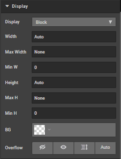
Display
Choose from the dropdown list to select display default is block, options are 'Flex', 'inline', 'none' and 'inline block'
Width
Specify a width
Max width
Specify a max width
Min width
Specify a min width
Height
Specify a height
Max height
Specify a maximum height
Min height
Specify a minimum height
BG
Change the background colour
Overflow
Chose from visible, not visible(icon) Scroll, scroll x
Spacing
Click on margins or borders to increase the margin or border by pixels
Borders
Click on borders to increase the border by pixels
How is this guide?
Last updated on
Link block
The link block component lets you add links to your CMS pages, with options for opening in a new tab and combining with other components like images.
Product list
The product list component displays a list of products from a category, with options for site selection, product count, and custom ranking.