Card
About the card component
The Card component is mainly used on static pages. It fills the space allocated in a layout and provides areas for a header and content below. You can add Text components inside a Card, making it ideal for listing out policies or grouping related information.
Open the CMS editor where you want to add or edit a Card component.
Drag the Card component onto your page.
Add a header and the content you want to show inside the Card.
Save your changes in the editor.
Please note that in its original form, the header of the card component is not editable and appears in a grey colour when used on the front end of the site. We can update this component to make the header editable and change the colour to suit your branding. Please contact us if this is something you would like to add to your CMS.
Card component settings
All Card components support the standard CMS settings below. Use these tabs to control layout, typography, and display for your card:
Settings
Header
Enter the text you want to appear in the header of the card.
Footer
Enter the text you want to appear in the footer of the card.
General
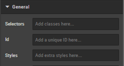
Selectors
In this box you can add classes that are defined elsewhere on the site to a specific page.
ID
ID is used to direct user to an element of the page or identify it for future use, so you can link to this aspect of the page.
Styles
Styles are used to add a specific style not predefined in a class. You can add style settings which can be applied against any component. Below are a list of styles you can add:
- Margin (either just
"margin:"or specific sides of a component like"margin-top:"or"margin-left:") - Padding (either just
"padding:"or specific sides of a component like"padding-top:"or"padding-left:") - Max Width
- Font
- Border
- ID
Examples:
max-width: 352px!important;
margin-bottom: 0 auto;
padding-top: 30px;
To center an image: margin:auto;
To center text/markdown: text-align: center;
To make a component go edge-to-edge: margin-left:-15px;margin-right:-15px
Typography
This section controls the text that appears on the page.
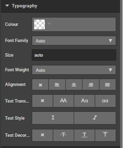
Colour
This box can be used to change the colour of the text. Use hex colour codes eg Red #ff0000 White #ffffff
Font Family
Specify the font family or leave blank to automatically inherit the default page font
Size
Specify the size or leave blank to automatically inherit the default initial size
Weight
Specify the weight from the dropdown list, choose from 'light', 'normal' or 'bold' or select 'auto' to automatically inherit the default weight.
Alignment
Use icons to select the alignment choose from: 'no alignment', 'left align', 'centre align', 'right align' and 'justify' respectively
Text transform
Use icons to change the text from block capitals to lower case or title case or no transformation.
Text style
Use icons to choose from Italicised or not.
Text decoration
Use icons to choose from no decoration, strikethrough, underline or overline
Display
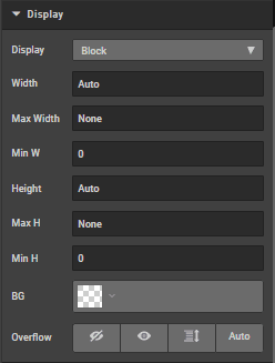
Display
Choose from the dropdown list to select display default is block, options are 'Flex', 'inline', 'none' and 'inline block'
Width
Specify a width
Max width
Specify a max width
Min width
Specify a min width
Height
Specify a height
Max height
Specify a maximum height
Min height
Specify a minimum height
BG
Change the background colour
Overflow
Chose from visible, not visible(icon) Scroll, scroll x
Spacing
Click on margins or borders to increase the margin or border by pixels
Borders
Click on borders to increase the border by pixels
How is this guide?
Last updated on
Creating components
If after using the CMS, you find there is something you can't do, the admin contains the ability to add new components. Contact your developer to discuss the possibilities.
Carousel slide
The Carousel slide component is used to contain and display content within a carousel, allowing multiple slides per carousel in the CMS.