Cheat codes
A collection of cheat codes for CSS, margin vs padding, REM vs PX vs Percentage, and Bootstrap selectors to enhance your web development skills.
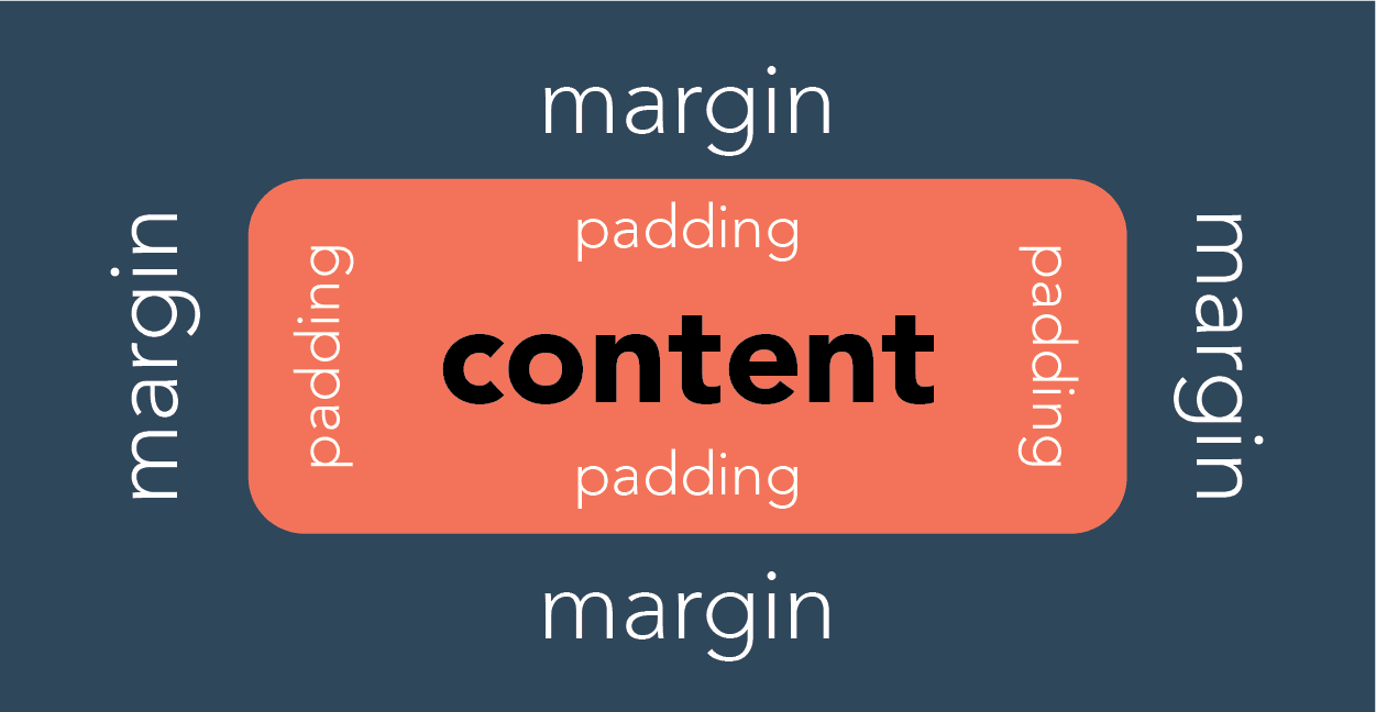
Margin vs padding:
In CSS, a margin is the space around an element’s border, while padding is the space between an element’s border and the element’s content. Put another way, the margin property controls the space outside an element, and the padding property controls the space inside an element.
This video shows how to add margin and padding using the editor.
This video shows how to add margin and padding using CSS in the styles field.
This video shows how to add margin and padding using bootstrap classes in the selectors field.
Styling field (css styles)
Example 1
margin-bottom:10px;margin-top:10px;Example 2
margin-left:3rem;margin-right:3rem;margin-bottom:50px;margin-top:50px;Example 3
padding:50px;Positioning an image in the centre of a column/block using css
Using the code in the styles field will centre an image in a column/block.
display: block; margin: 0 auto;Using classes in the selectors field
Margin and Padding using selectors field (classes)
The editor supports adding spacing bootstrap classes to the selectors field.
my-3mx-3py-3px-3p-3These can be added to any block in the classes or selectors field, this includes layout blocks. Spacing for bootstrap is between the numbers 0-5. If the site supports Tailwind then the classes can be above 5. This won't display on the editor but will on the front end of the site.
Break points using selectors Field (classes)
The editor supports adding bootstrap selectors to the selectors field. When using these in the editor they need to be prefixed with v- Below are some useful ones:
v-justify-content-center v-align-items-center- Center align content within an empty blockv-d-none- hide everywherev-d-md-none- hide from tablet up (shown on mobile)v-d-lg-none- hide from desktop up (shown on mobile and tablet)v-d-none v-d-md-block- hide on mobile (shown on tablet up)v-d-none v-d-lg-block- hide on mobile and tablet (shown on desktop)
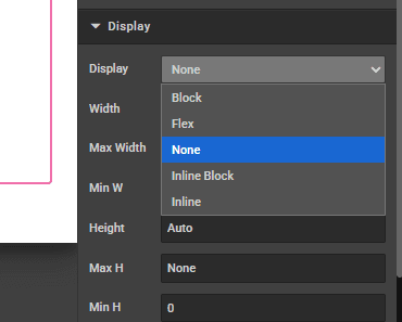
In the CMS editor a lot of the components already have the type of block specified. After the component is added to the page, in the display section, there is a dropdown next to display. If you are wanting to not display on mobile, this needs changing to display none. Otherwise the default is display block which will conflict with what is manually added in the selectors section.
When using these selectors most clients opt to use them on an empty block or a layout block so they affect the child components.
Hiding content using bootstrap:
REM vs PX vs percentage
- Example 1:
1rem= A scalable spacing value type, which is best used when adding margin or padding. - Example 2:
10px= An absolute and fixed value. - Example 3:
10%= Percent value is always relative to another value, be it the element’s parent value or from another property of the element itself.
How is this guide?
Last updated on