Styling in the CMS
Documentation prepared by Ryan Coleman
Introduction
Layouts on the website homepage are created using a combination of two methods:
Using column components, for columnated layouts Using CSS classes (known as ‘Selectors’ in the CMS) to control visibility, spacing and other attributes.
The frontend of the website is built using a CSS framework called Bootstrap, which allows the website to accommodate responsive designs for mobile users and the easy construction of layouts in a modular fashion. Bootstrap supplies the CSS/selectors which can be used in the CMS editor.
Specifically, the website uses Bootstrap v4.6—documentation is available online which can support learning about the framework and how to use its features: https://getbootstrap.com/docs/4.6/getting-started/introduction/
Note that when applying CSS classes/selectors in the CMS, you do not need to include the period character at the beginning.
The aim of this document is to provide instructions for how to achieve premade layouts using the CMS editor and selectors. As the homepage changes design and layout constantly, it’s important to ensure that this is done in a consistent manner and that designs suit each device type.
Learnings from this document can be applied anywhere in the CMS, however this document will focus predominantly on the homepage given its significance and scope of changes.
Using Selectors
The following selectors are examples which could be used to achieve simple styling changes to a component in the CMS. See the Selectors Library section later in this document for a more comprehensive library.
| Selector | Action |
|---|---|
| d-none | Hides the component |
| font-primary-bold | Changes the font of text to Open Sans Bold. |
| text-uppercase | Forces the text to capitals. |
| text-white | Changes the text colour to white. Useful when displaying text on dark or coloured backgrounds. |
| m-5 | Applies a large margin around a component. |
Device Modifiers
The above selectors can be modified further by a size for the user’s device that you intend to apply it to. For example, changing d-none to d-md-none will modify it so that it only hides that component on medium-sized devices or larger. Available values include:
- Extra small and upwards (i.e. all devices): Do not include a modifier
- Small and upwards (≥576px):
sm - Medium and upwards (≥768px; this is the point at which our website is designed to switch between desktop/tablet and mobile layouts, and is therefore the most commonly used modifier):
md - Large and upwards (≥992px):
lg - Extra large (≥1200px):
xl
These modifiers can be applied to virtually any selector, e.g. text-lg-center would centrally align text only on large devices and upwards.
Bootstrap is a mobile-first CSS framework, so bear in mind that modifiers are designed to target a particular device size or larger.
Size Modifiers
Similar to device-specific modifiers, some selectors require you to specify a size value to achieve a certain effect. For example, changing m-5 to m-4 will decrease the amount of margin applied to a component. Available values include:
1(smallest)2345(largest)
Size modifiers can be mixed with device modifiers, e.g. m-md-5 would apply a large margin around a component when viewed on medium sized devices and larger (i.e. desktop and tablet devices for our website).
Directional Modifiers
Another set of modifiers which can be used are those which target a particular direction/edge of a component. These are typically limited to selectors such as those which set margins, paddings or borders. For example, changing m-5 to mb-5 will change the margin from being applied around the component to only its bottom edge. Available values include:
All directions: Do not include a modifier
- Top:
t - Right:
r - Bottom:
b - Left:
l - Top and bottom:
y - Left and right:
x
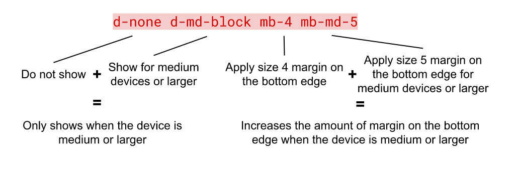
Directional modifiers can optionally be combined with both size and/or device modifiers to create more specific styling applications, for example:

Combining Selectors
Multiple selectors can be applied to a component at the same time to achieve advanced styling applications, for example:
Homepage Layouts
Full-width Hero Images
Mobile Image: d-md-none w-100 mb-0
Desktop Image: d-none d-md-block w-100 mb-md-5
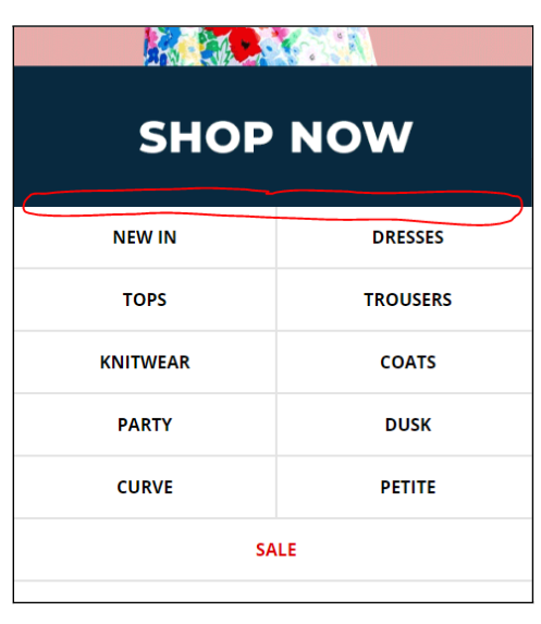
mb-0is used instead ofmb-4for the mobile image because you deliberately want to remove any spacing along the bottom edge of this asset so that it visually hugs against the mobile links underneath it:
Full-width Images
Mobile Image: d-md-none w-100 mb-4
Desktop Image: d-none d-md-block w-100 mb-md-5
Two-column Images
Left Image: w-100 mb-4 mb-md-5 px-4 pl-md-5 pr-md-4
Right Image: w-100 mb-4 mb-md-5 px-4 pl-md-4 pr-md-5
- Horizontal padding declarations for desktop are uneven and mirrored between the left and right columns to ensure that equal amounts of spacing are applied between the image’s inside edges when taken together and their outside edges
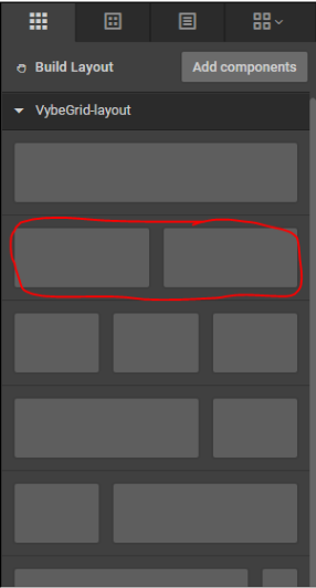
- Use a ‘Column 6’ layout to create this column layout:
- Inside the column’s ‘General’ settings, ensure that the ‘Gutters’ setting is set to ‘No Gutters’ and ‘Column Type’ is set to ‘Stack’:
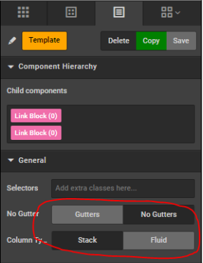
- Gutters’ would add pre-defined spacing to the columns which is suitable for use on other CMS pages, but does not match the spacing used for images on the homepage, so ‘No Gutters’ is set and the spacing is manually controlled using the padding selectors instead
- ‘Stack’ ensures the images are arranged vertically on mobile devices; ‘Fluid’ would squeeze the two images side-by-side on mobile and make them too small.
Three-column Images
Left Image: w-100 mb-4 px-4 mb-md-5 px-md-5
Middle Image: w-100 mb-4 px-4 mb-md-5 px-md-5
Right Image: w-100 mb-4 px-4 mb-md-5 px-md-5
- On desktop, it is impossible to set spacing around a three-column layout using selectors which perfectly matches the two-column layout for all three images, so three-column layouts always have slightly more spacing than other elements
- Use a ‘Column 3’ layout to create this column layout:
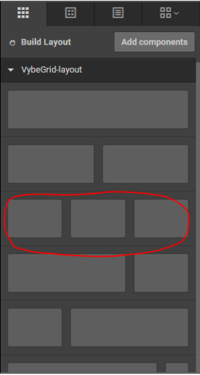
- Similar to two-column layouts, ensure ‘No Gutters’ and ‘Stack’ are set.
Selectors Library
The following is a library of pre-devised selectors which are typically used across the website that are ready to use. The majority of these selector can be modified in some way by adding device, size or directional modifiers to them.
This list is not exhaustive and cannot account for every scenario, so it is recommended that the Using Selectors section above is referred back to, with Bootstrap documentation used as a full reference.
Display Selectors
| Selector | Action |
|---|---|
d-none | Hides the component |
d-md-none | Hides the component for medium devices or larger. Useful for showing a component only on mobile devices. |
d-md-block | Shows the component for medium devices or larger. Useful when combined with d-none to hide a component on mobile devices, but show it on desktop or tablet devices. |
https://getbootstrap.com/docs/4.6/utilities/display/
Sizing Selectors
| Selector | Action |
|---|---|
w-100 | Ensures a component fully fits the space it is allocated. Could cause images to appear blurry if they are smaller than the space they are allocated, as they will be upscaled if used. |
w-50 | Ensures a component is 50% of the size of the space it is allocated. |
w-md-100 | Ensures a component fully fits the space it is allocated on medium devices or larger. Could be used in conjunction with w-50 to make an image smaller on mobile and larger on desktop devices, for example. |
w-auto | Ensures a component sizes itself according to its own natural dimensions. Could be used in conjunction with w-50 to make an image smaller on mobile and original size on desktop devices, for example. |
https://getbootstrap.com/docs/4.6/utilities/sizing/
Spacing Selectors
| Selector | Action |
|---|---|
mb-5 | Applies a large amount of margin along the bottom edge of a component. |
mb-4 | Applies moderate margin along the bottom edge of a component. |
mb-md-5 | Applies a large amount of margin along the bottom edge of a component on medium devices or larger. Could be used in conjunction with mb-4 to apply smaller margin on mobile and larger on desktop devices, for example. |
p-5 | Applies a large amount of padding inside the component. Think of padding as the spacing inside a component, whereas margin is spacing outside of the component. |
p-4 | Applies moderate padding inside the component on medium devices or larger. Could be used in conjunction with p-md-5 to apply smaller padding on mobile and larger on desktop devices, for example. |
https://getbootstrap.com/docs/4.6/utilities/spacing/
Aligment Selectors
| Selector | Action |
|---|---|
img-center | Centrally aligns an image inside the space it is allocated. Typically only necessary if the image does not fully fit the space it is allocated, or when a sizing selector is used to override its size. |
text-center | Centrally aligns text inside the space it is allocated. |
mx-auto | Centrally aligns components which aren’t images or text. |
align-middle | Vertically aligns text to the middle of its container. Cannot be used in the majority of circumstances. Useful when adding text inside tables. |
https://getbootstrap.com/docs/4.6/utilities/text/ https://getbootstrap.com/docs/4.6/utilities/spacing/ https://getbootstrap.com/docs/4.6/utilities/vertical-align/
Typographic Selectors
| Selector | Action |
|---|---|
text-uppercase | Converts text to all capitals. |
font-primary-bold | Swaps the font of text from Open Sans to Open Sans Bold. |
text-black | Forces the text colour to black. Useful when overlaying text on light or coloured backgrounds. |
text-white | Forces the text colour to white. Useful when overlaying text on darker backgrounds. |
text-decoration-none | Removes underlines from text. Useful when you want to make text link to another page but not have the underline appear. |
h1 h2 h3 h4 h5 h6 | Mimics the styling of a page heading component, based on what is chosen, e.g. h2 matches to a h2 html tag. Useful when applied to a heading component to override its font size without using an inferior heading, or to make regular text appear as if it were a heading. |
https://getbootstrap.com/docs/4.6/utilities/text/
https://getbootstrap.com/docs/4.6/content/typography/
https://getbootstrap.com/docs/4.6/utilities/colors/
Miscellaneous Selectors
| Selector | Action |
|---|---|
bg-light | Makes the component have a light grey background colour. |
bg-dark | Makes the component have a dark grey background colour. |
bg-white | Makes the component have a white background colour. Useful when a component is nested inside another which has a different background colour set. |
bg-black | Makes the component have a black background colour. |
border | Adds a border around an element. |
https://getbootstrap.com/docs/4.6/utilities/borders// https://getbootstrap.com/docs/4.6/utilities/colors/